*Click on any photo to see this in slideshow mode

Nike Packaging
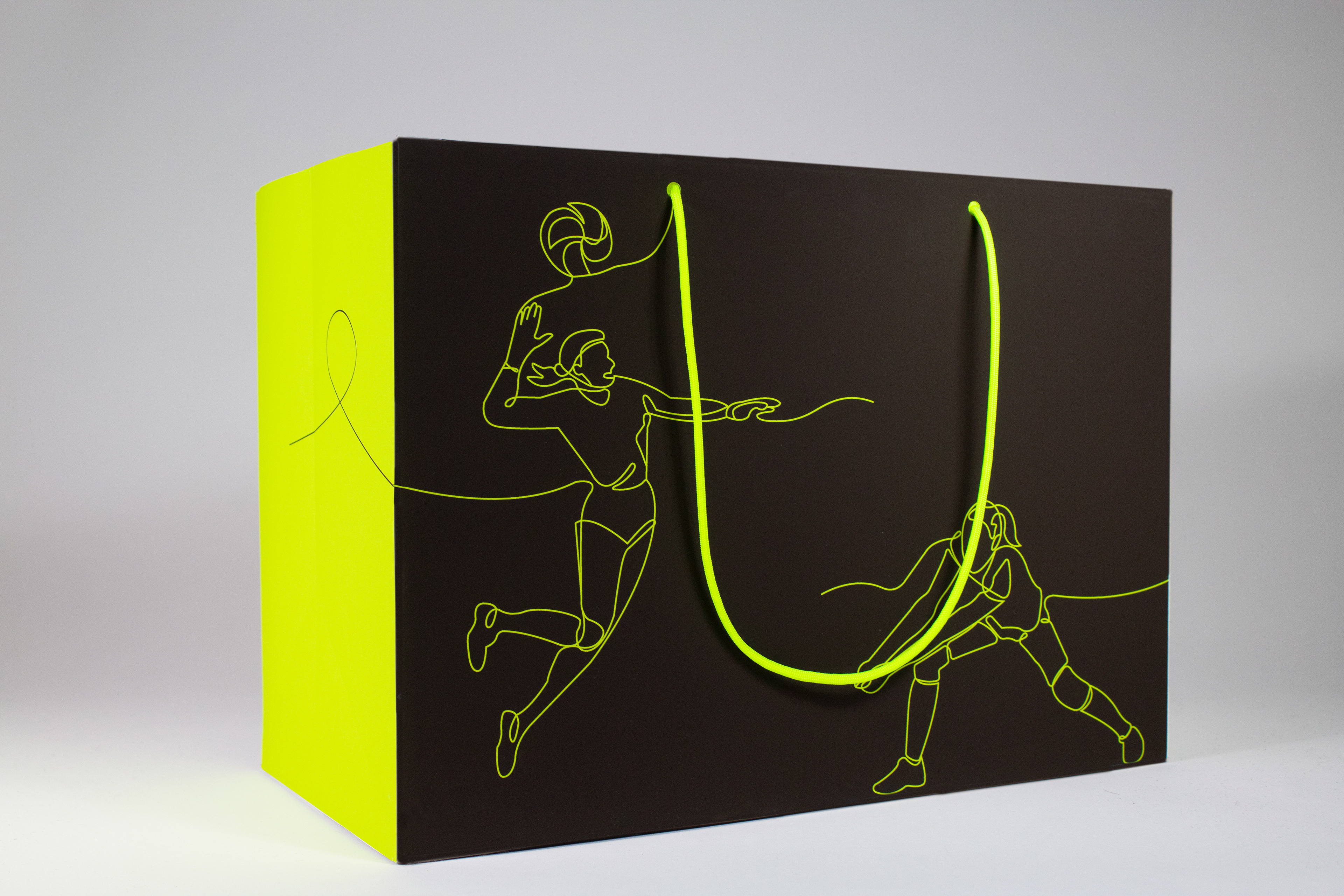
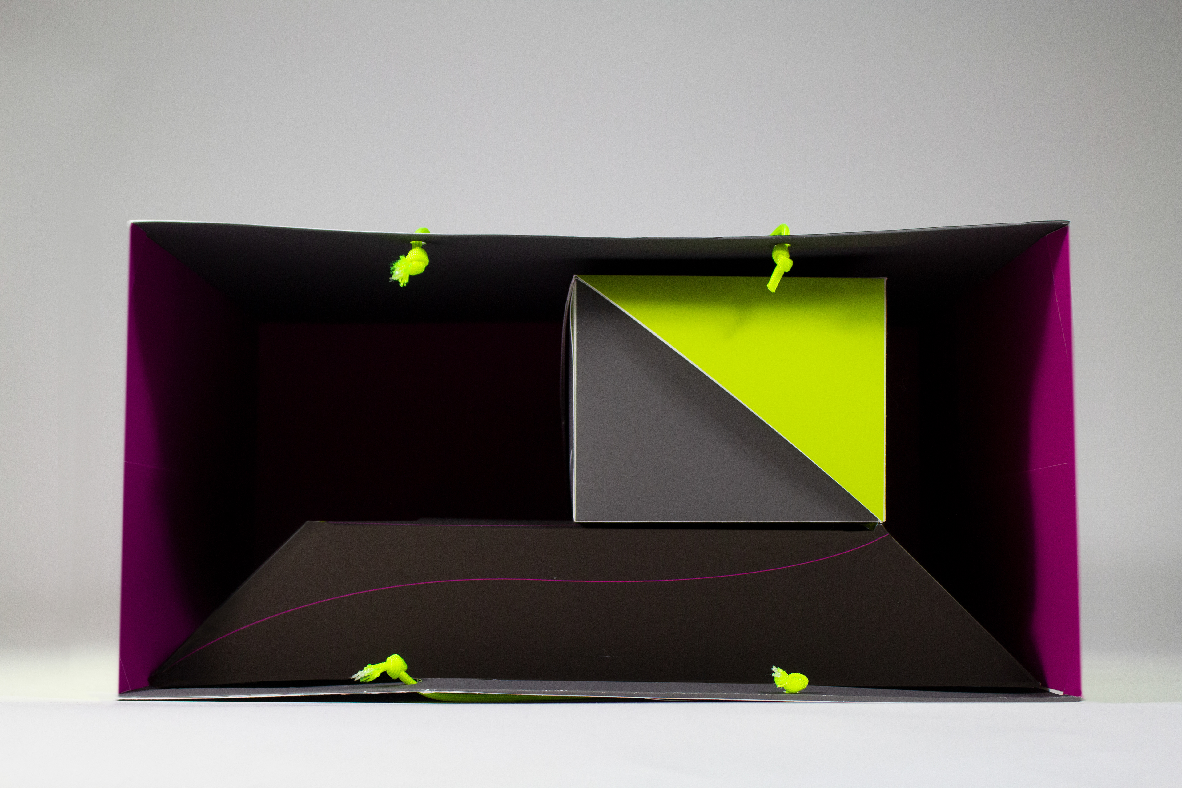
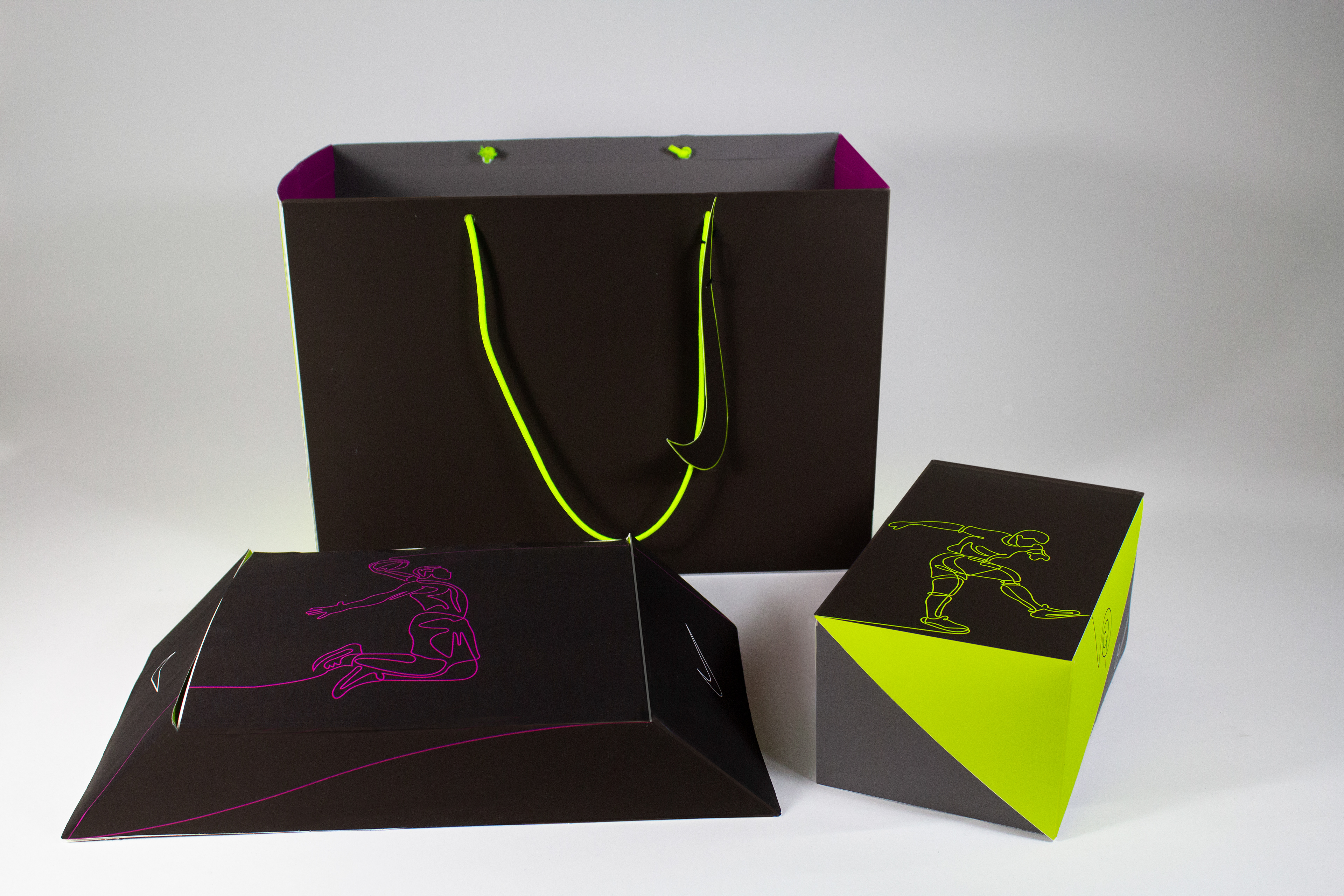
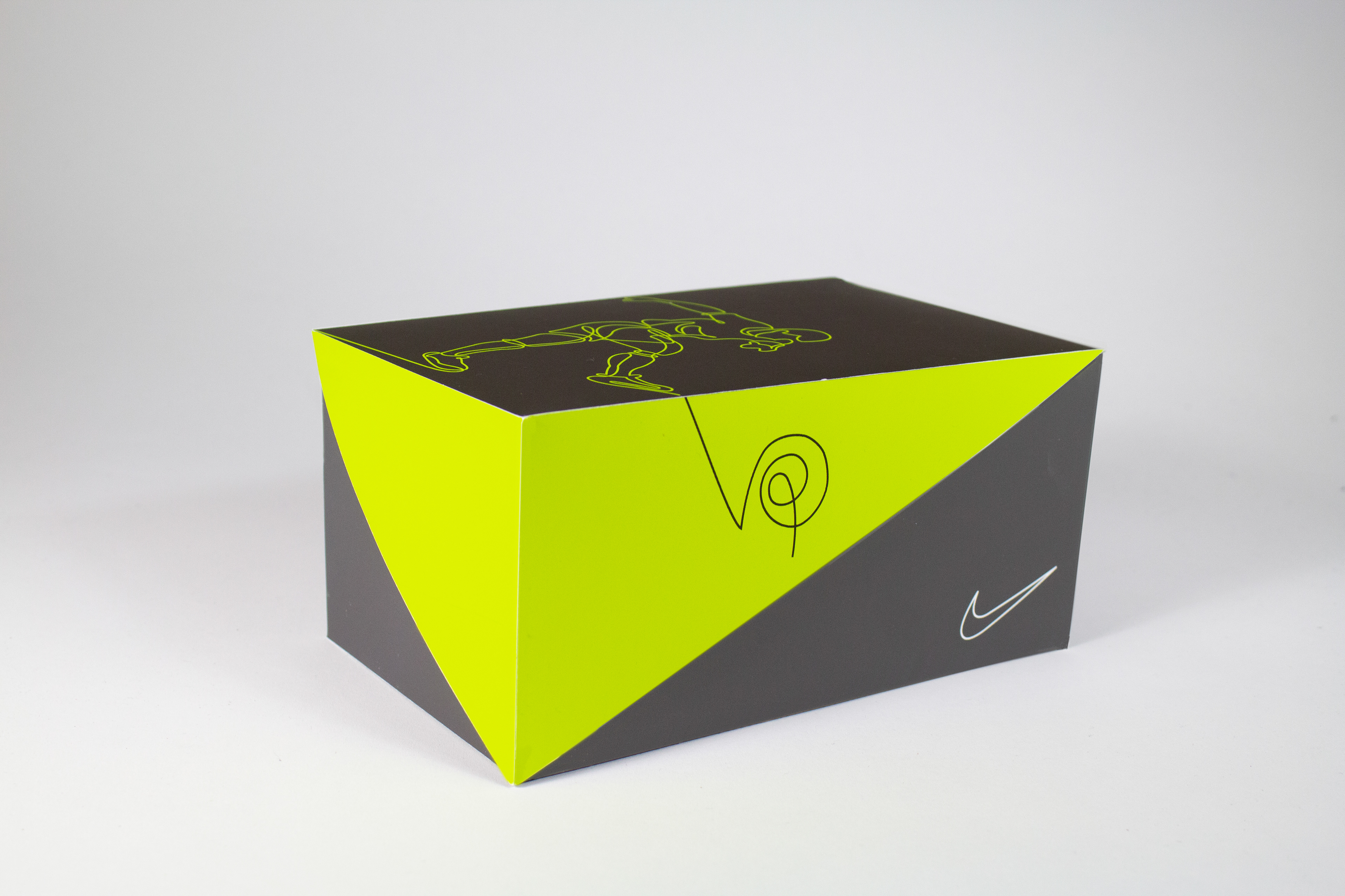
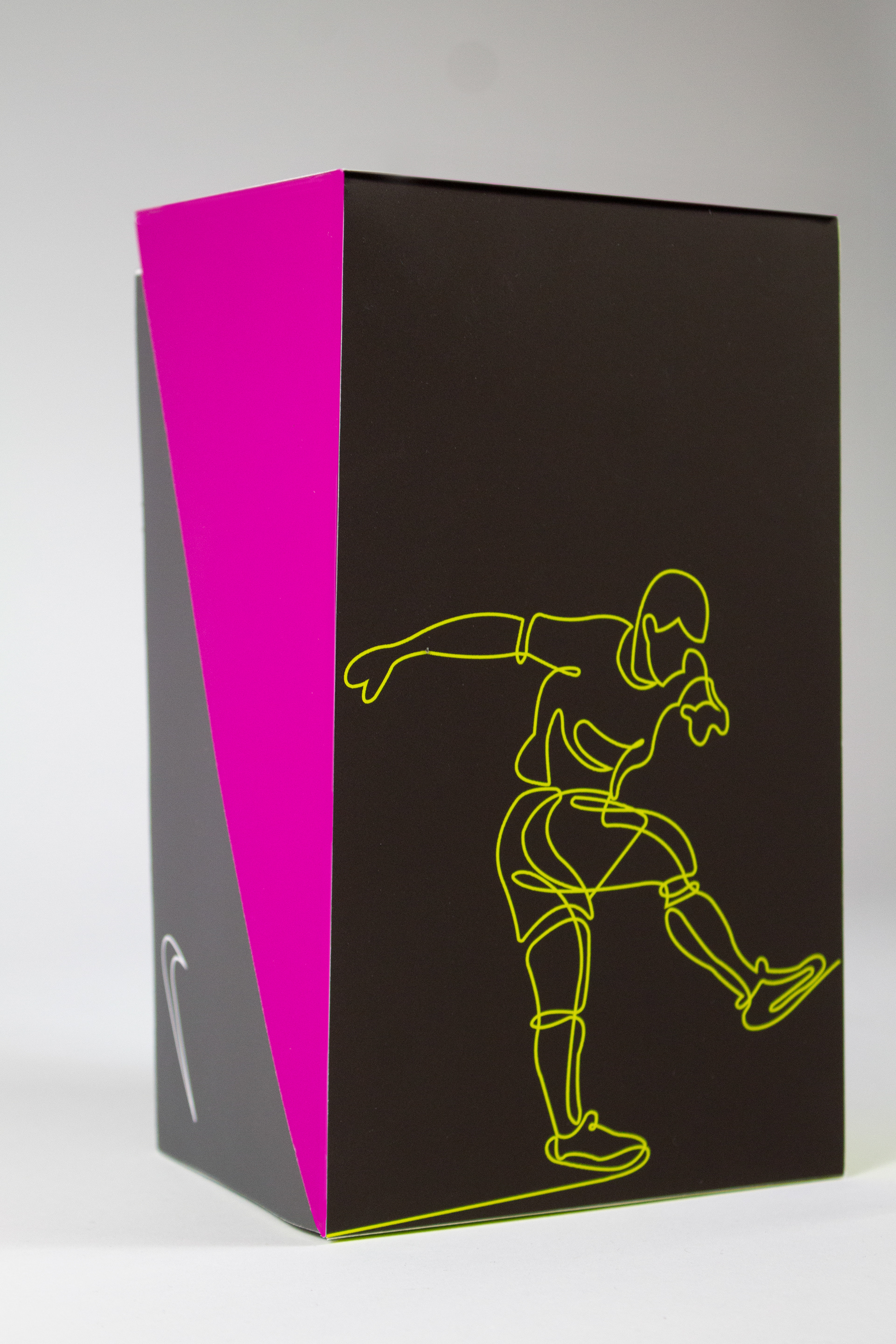
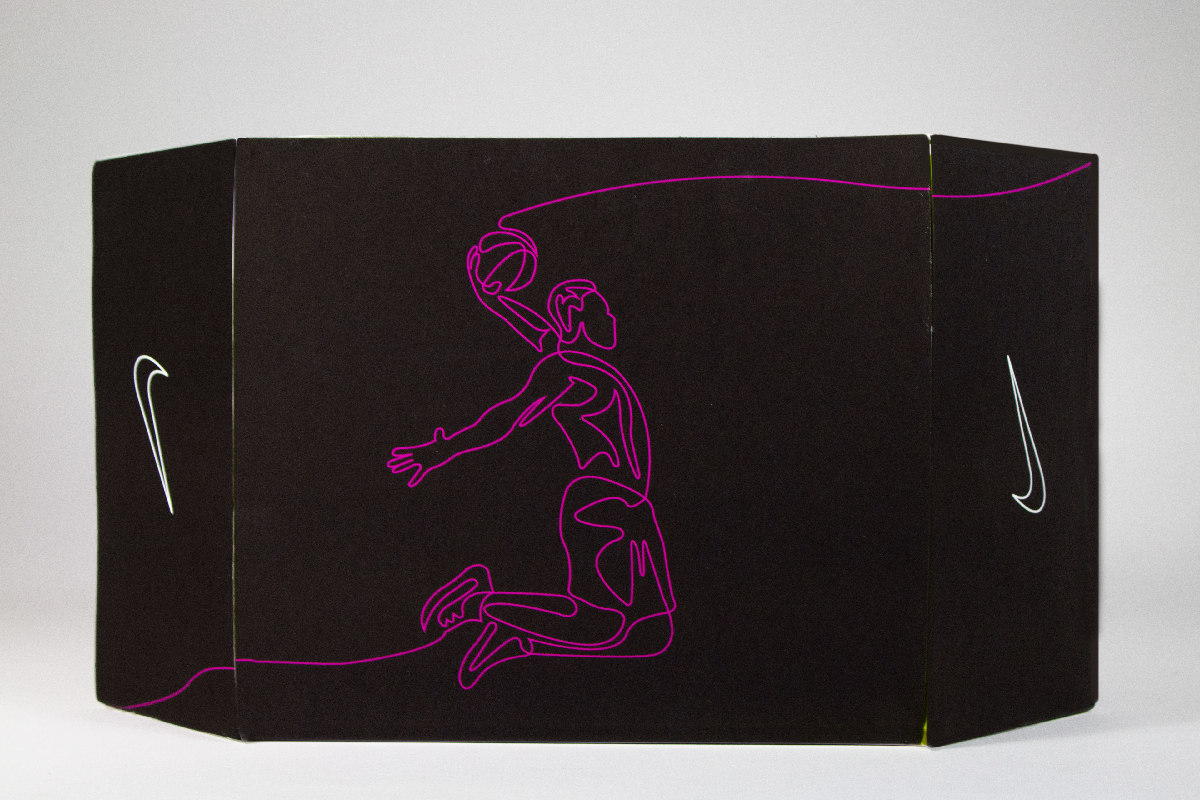
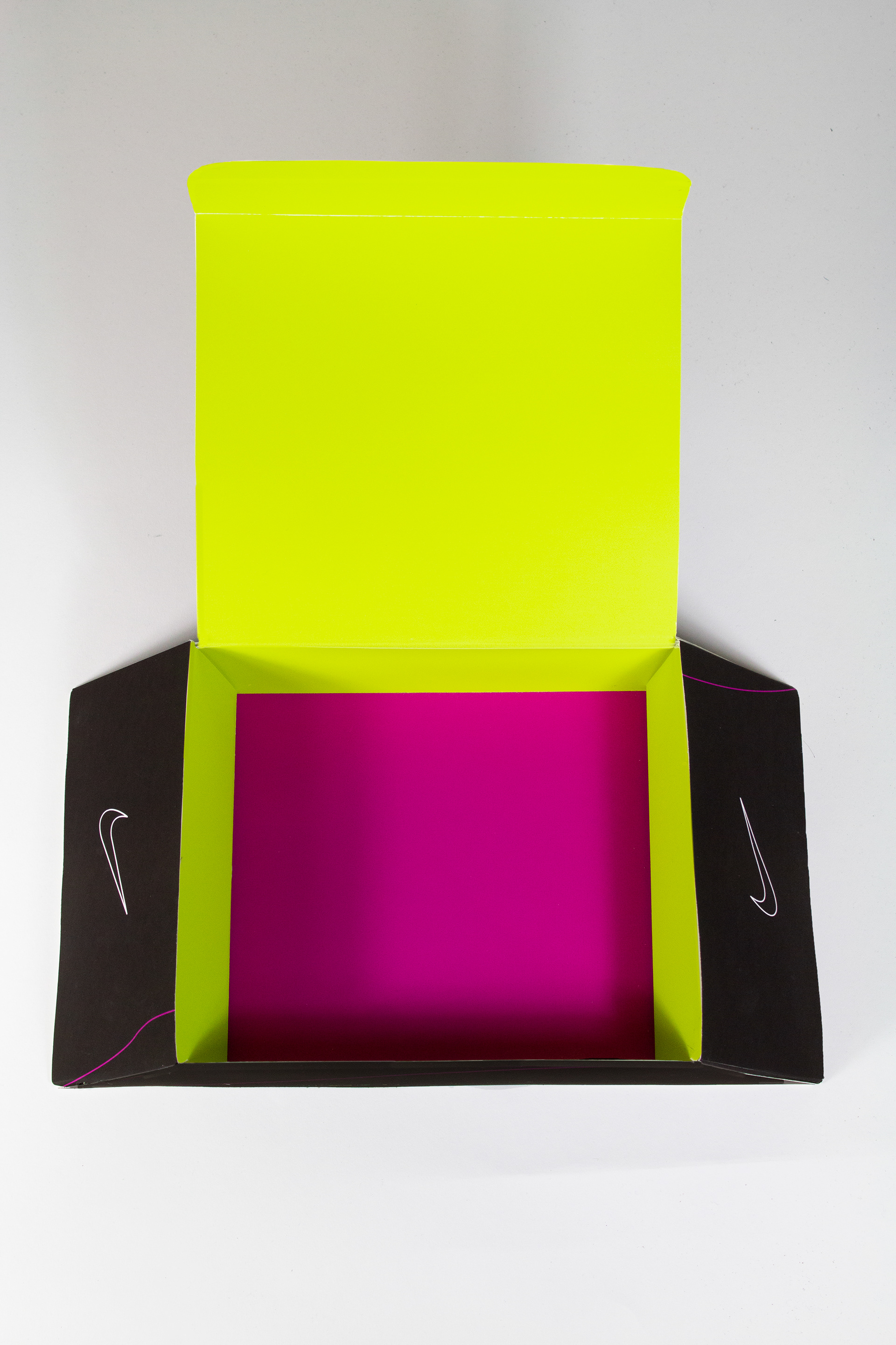
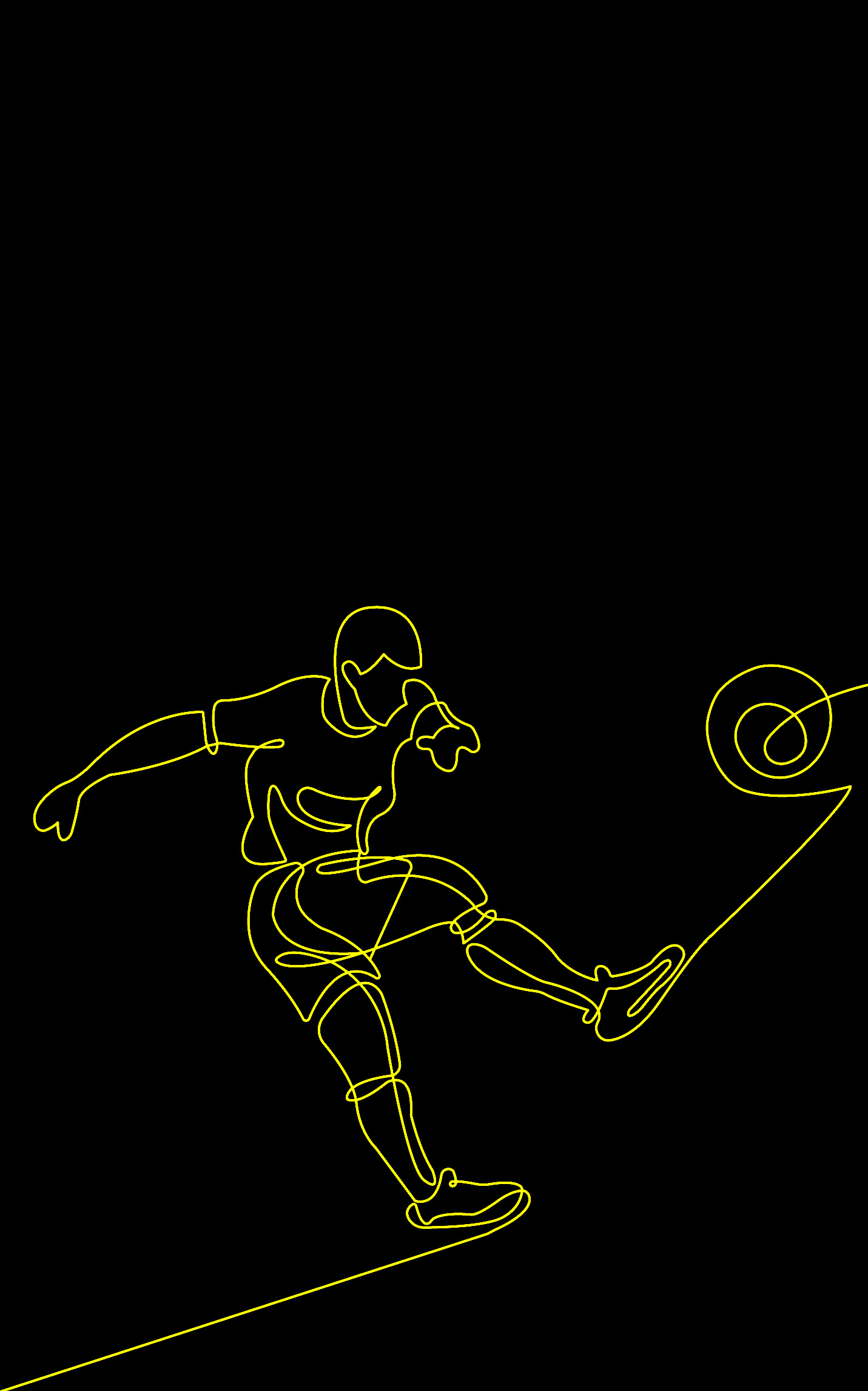
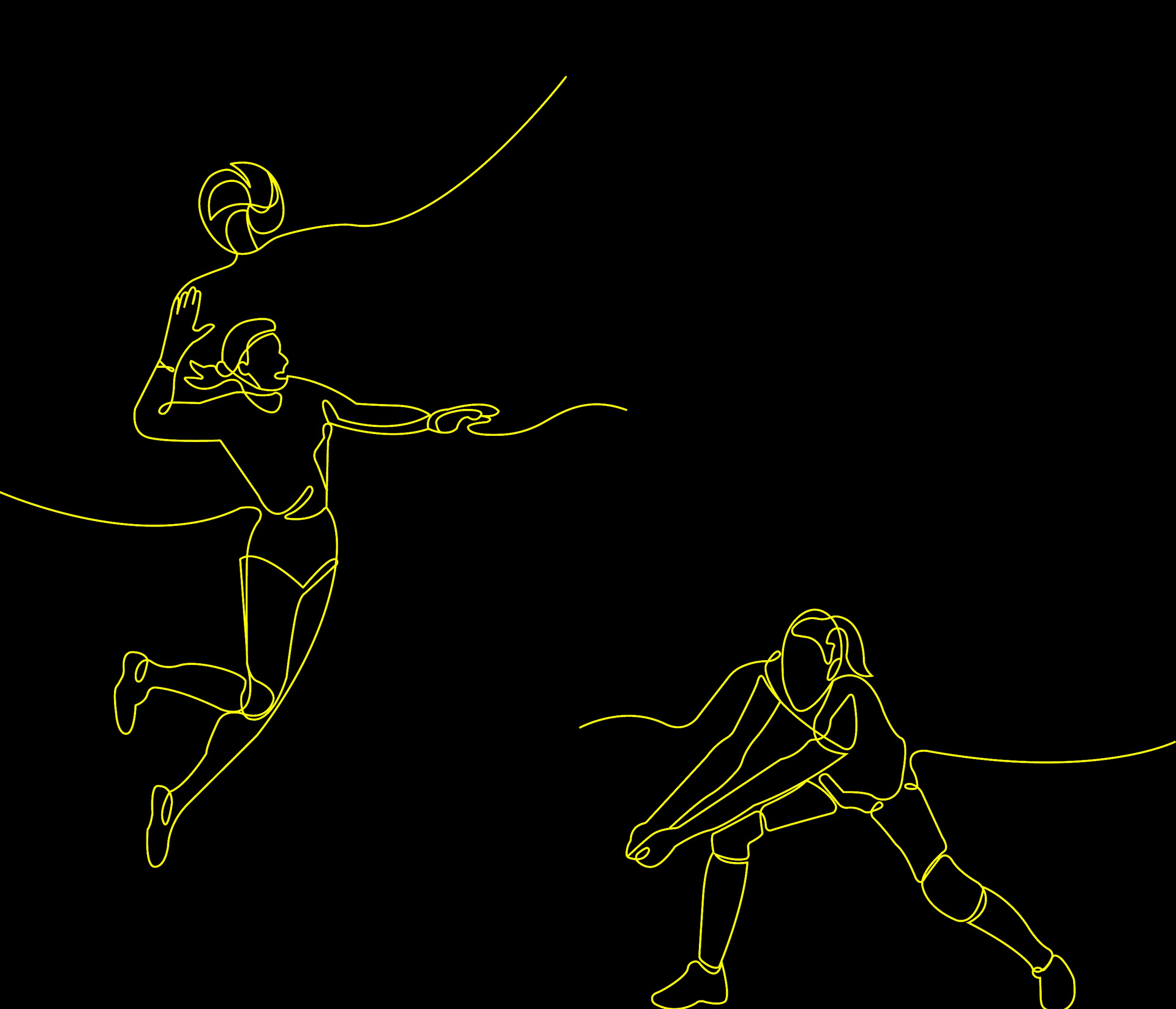
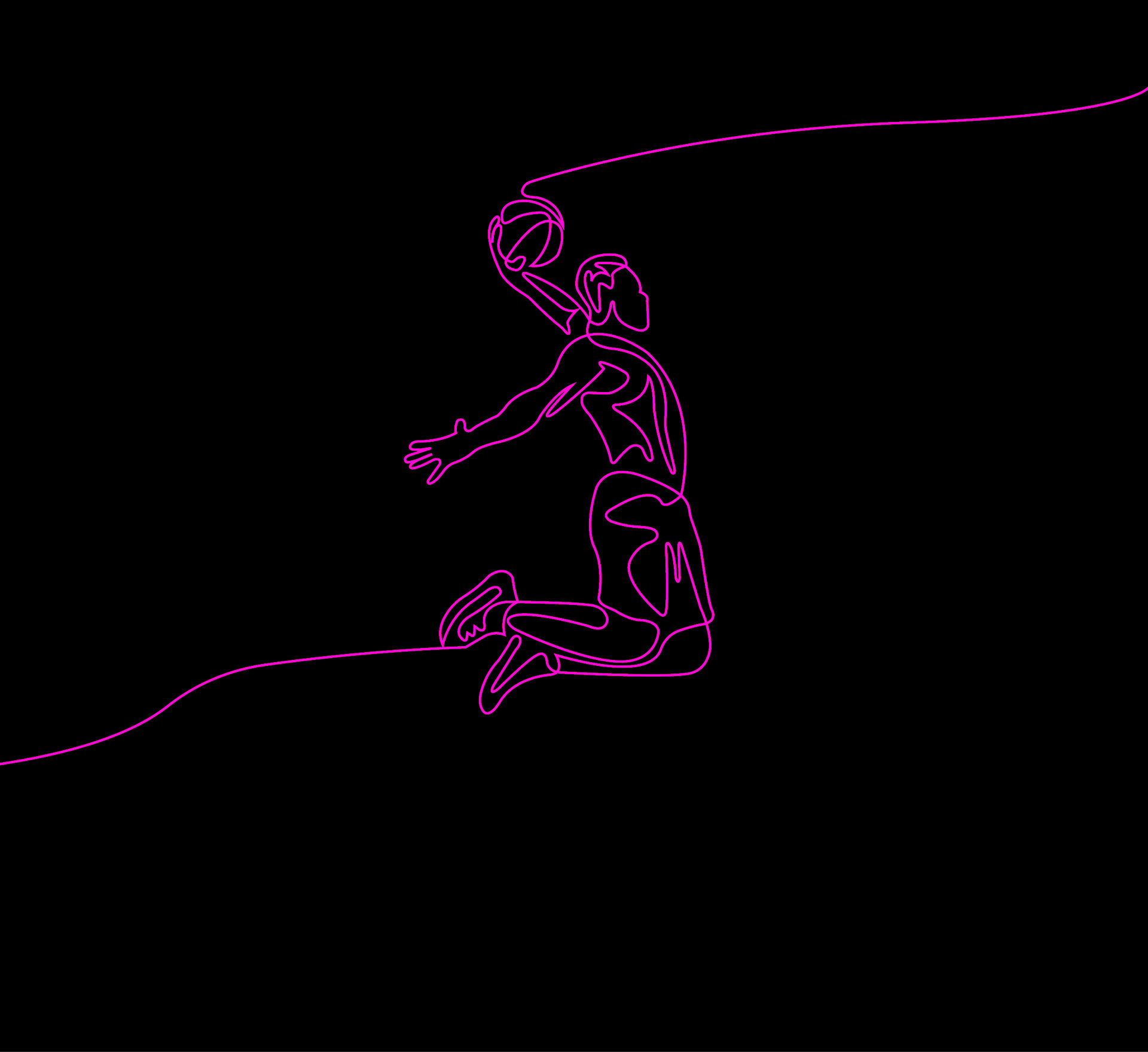
Nike is known for its simplistic but dynamic branding system. This Nike packaging, uses elements of the Pro-Elite series like the neon green, black, and grey palette were brought in. Imagery inspiration was pulled from their campaigns, where they frequently have athletes pictured completing dynamic actives. After reviewing their public mission statements for the future of Nike, and their publicly available branding guidelines, the decision was ultimately to include this dynamic composition through a line drawing rather than their normal photographic route.
Nike is trying to build loyalty to a younger demographic, especially women, and trying to build support from people who aren't traditional athletes. This inspired the illustration rather than the photographs; the illustrations are non-identifiable and don't look like any specific person, which would allow any person to connect with them. There were also selective decisions made to include female athletes within the illustrations to go back to the idea of representation and reaching towards the female athletic wear market.