*Click on any photo to see this in slideshow mode
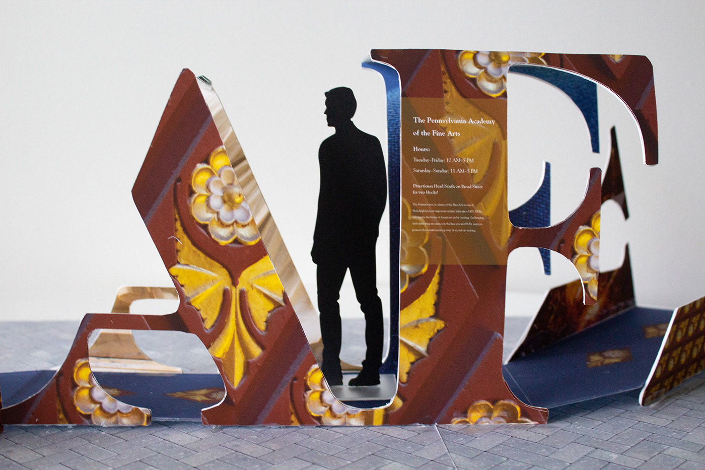
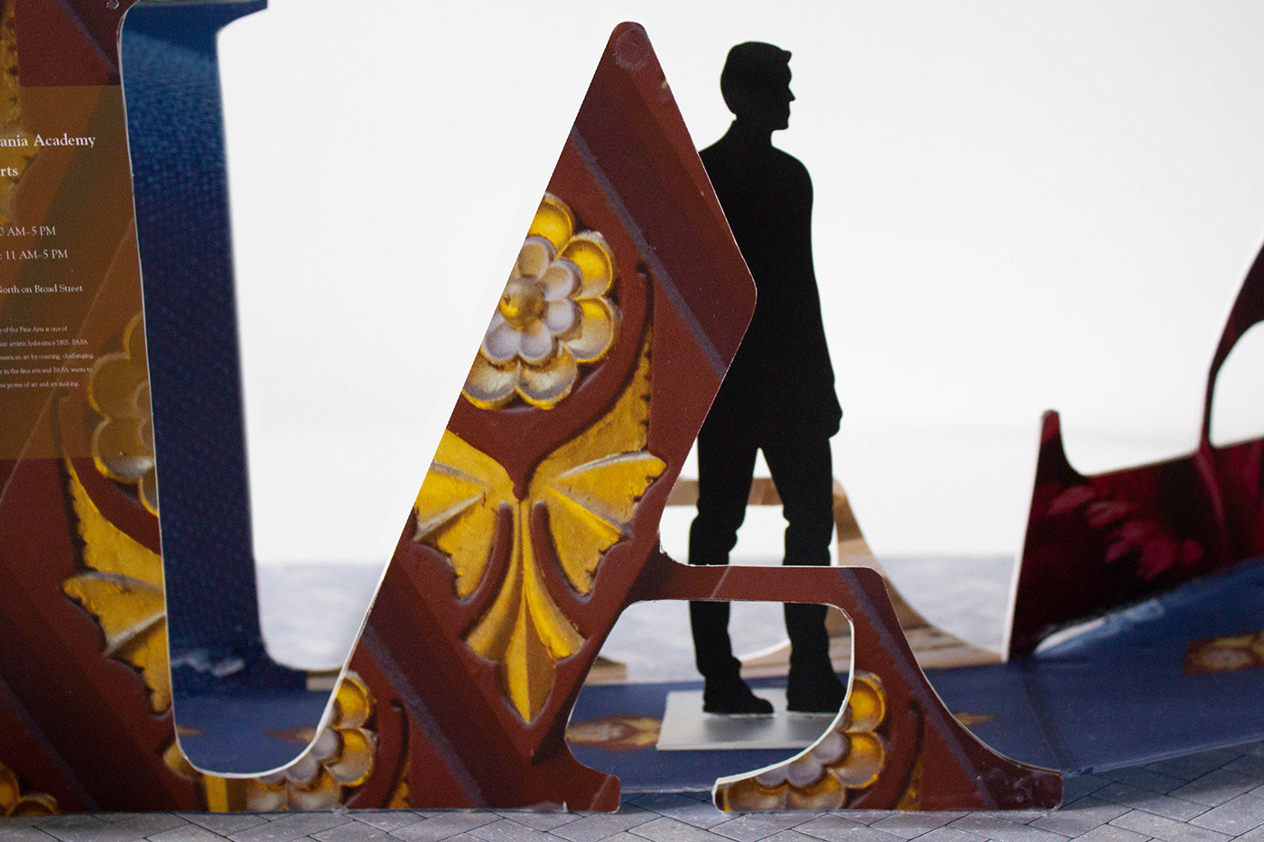
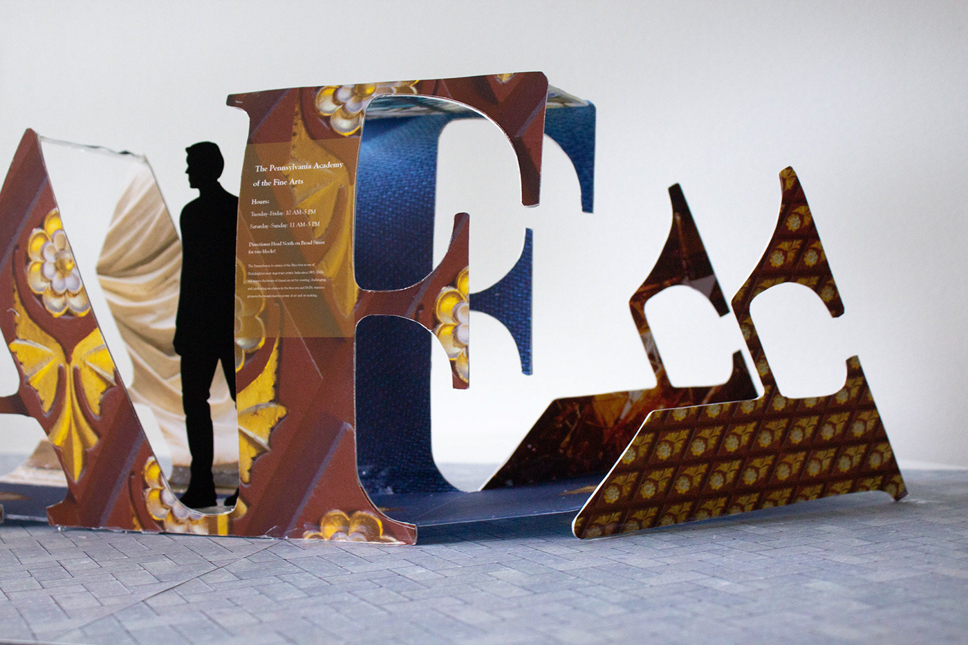
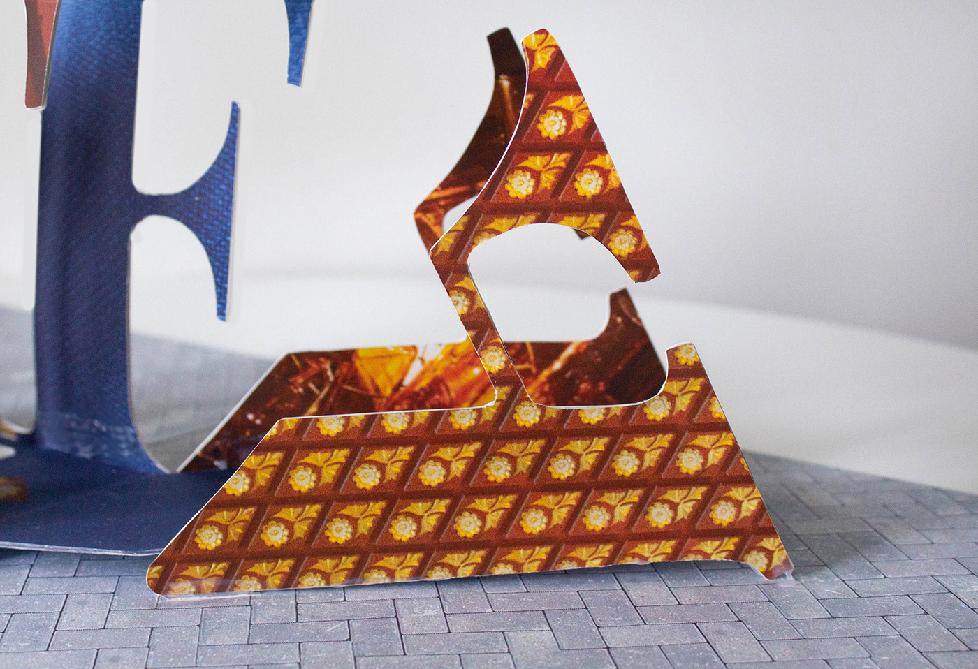
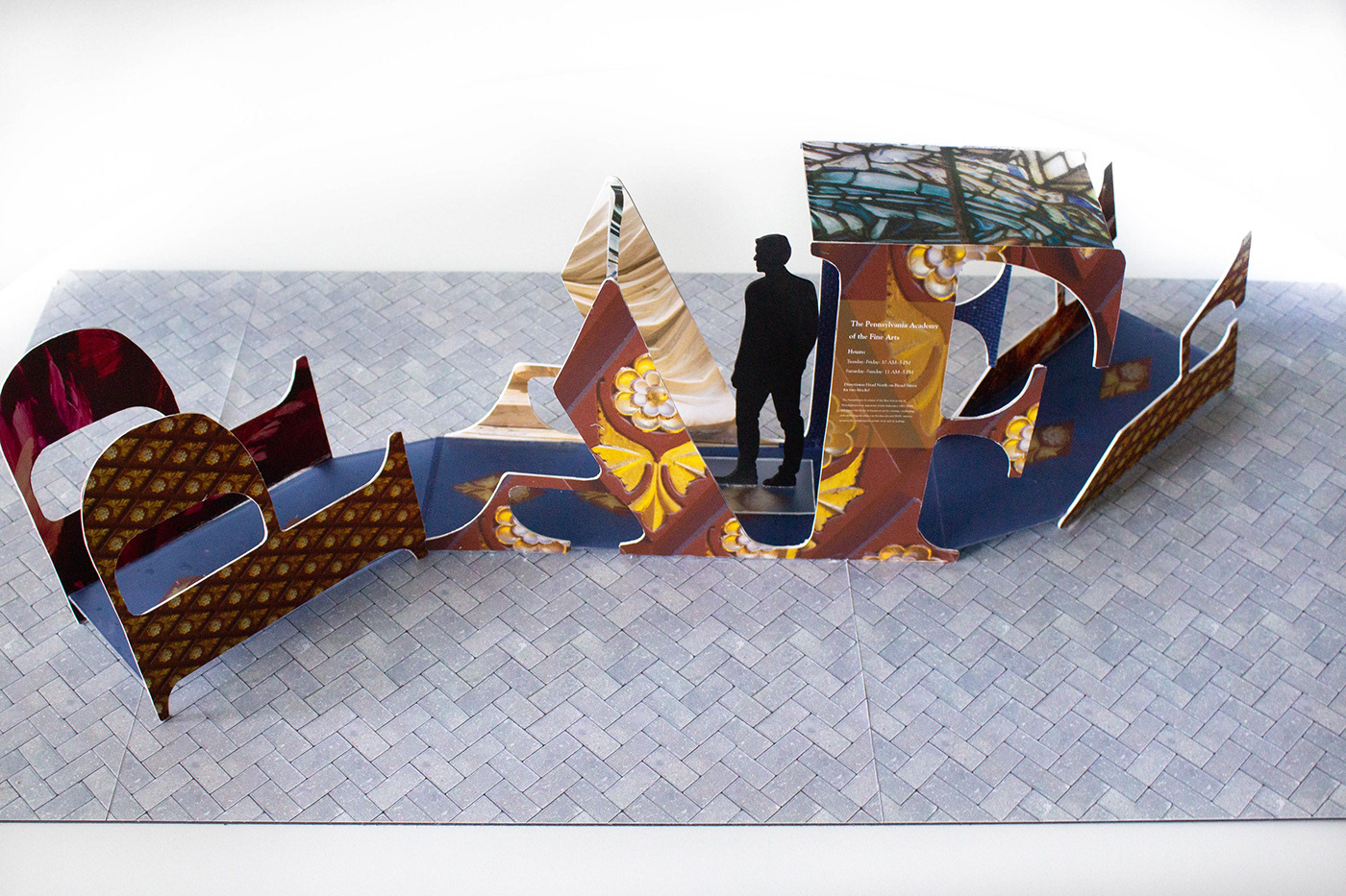
PAFA External Kiosk Mockup, Philadelphia PA, June 4th, 2019

The PAFA
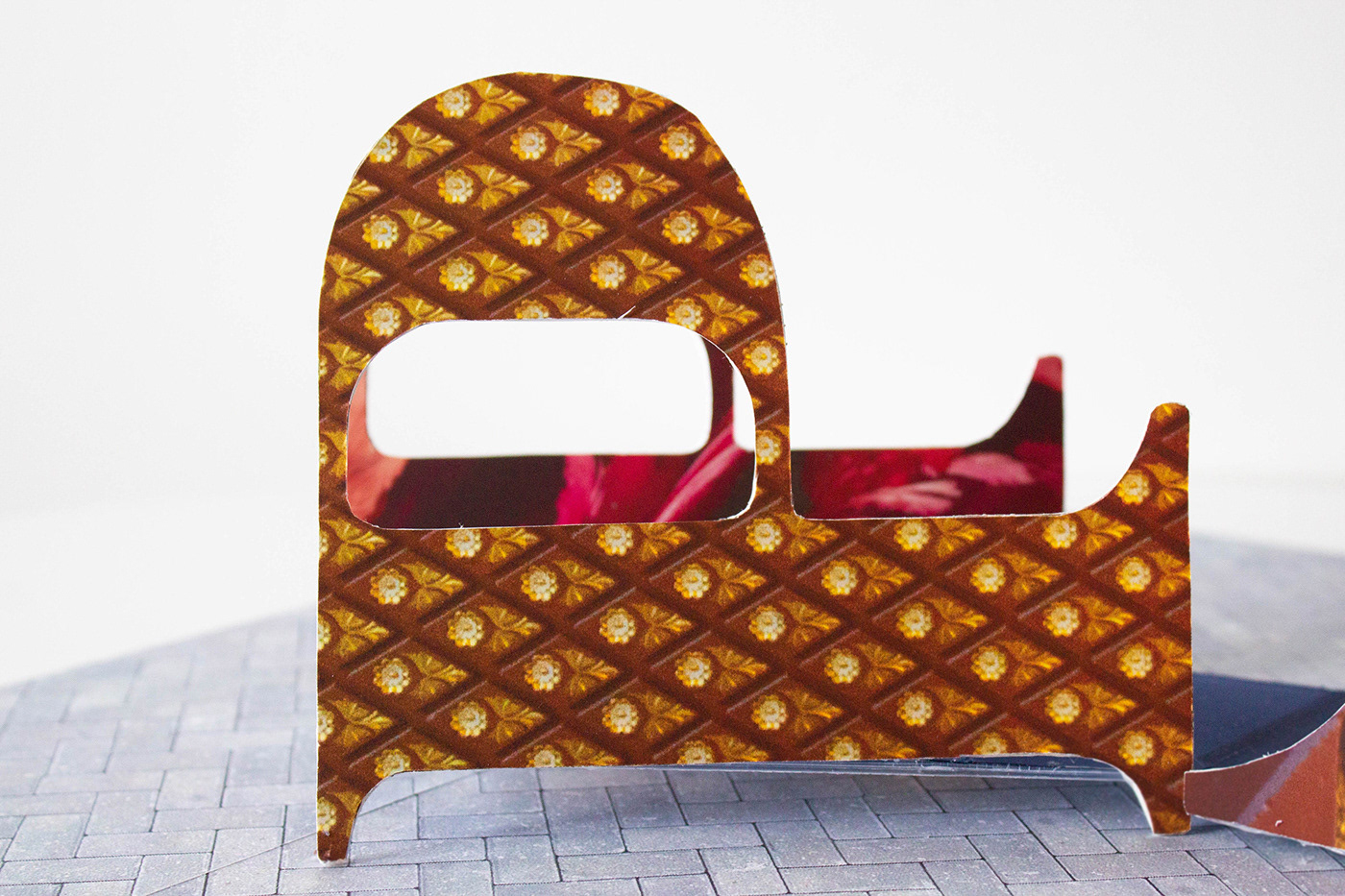
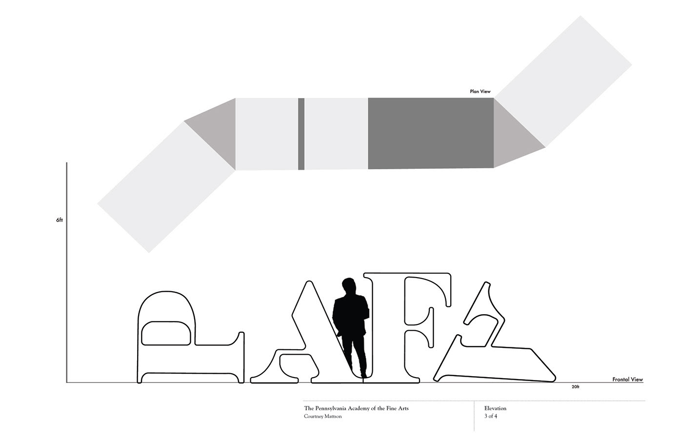
For this environmental graphic design piece, the task was to create a kiosk to represent and attract people to the museum from a different location. The museum chosen was the Pennsylvania Academy of Fine Arts (PAFA), which currently has a wide variety of work on display. The goal of the project was to capture the essence of the art and architecture of the museum while not giving too much away. What says PAFA, more than PAFA itself? Photographs that were taken during a few visits were superimposed upon the logo, the outside had photographs of the intricate architecture that the old building had while the inside was imposed with photos of some of the artwork at a very close up view. When deciding to make the final model, there were some potential safety concerns due to the sharp edges, so all corners were rounded. The letters were also set at different heights, some being turned on their sides, to create more variation in height and shape. Overall, the goal was to create a project that would represent the colorful, bold, traditional and innovative artwork that the PAFA continues to put
on display.
on display.
